Le graphique « diagramme circulaire » est également appelé « graphique en secteurs » ou « camembert ».
Objectifs :
- Avoir un visuel via un graphique afin d’afficher 1 donnée à 1 instant T.
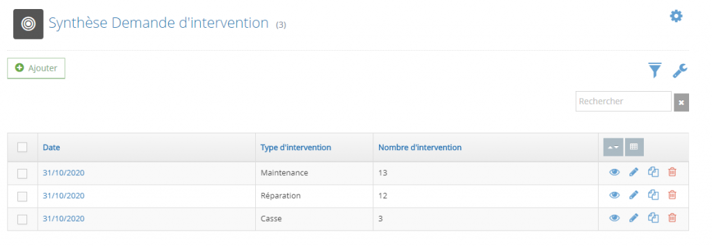
1. LA RESSOURCE DETAILLEE
Dans notre exemple, nous avons un nombre d’intervention attribué à un type d’intervention :
2. CREATION DU GRAPHIQUE
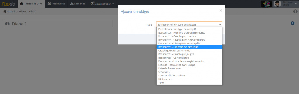
Intégrer votre graphique dans le tableau de bord :
- Cliquer sur une zone « + Widget«

- Suivre les étapes suivantes :
a. Sélectionner le widget : diagramme circulaire
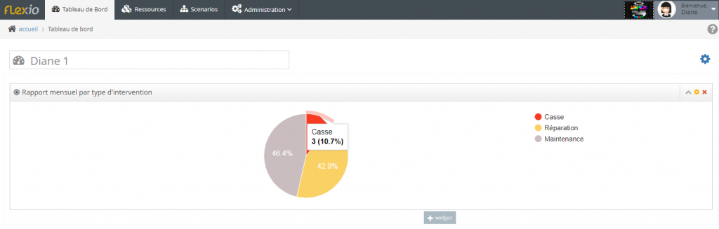
b. paramétrer le widget

c. le widget est opérationnel
TUTO UTILE :
Comment creer une ressource de cumul